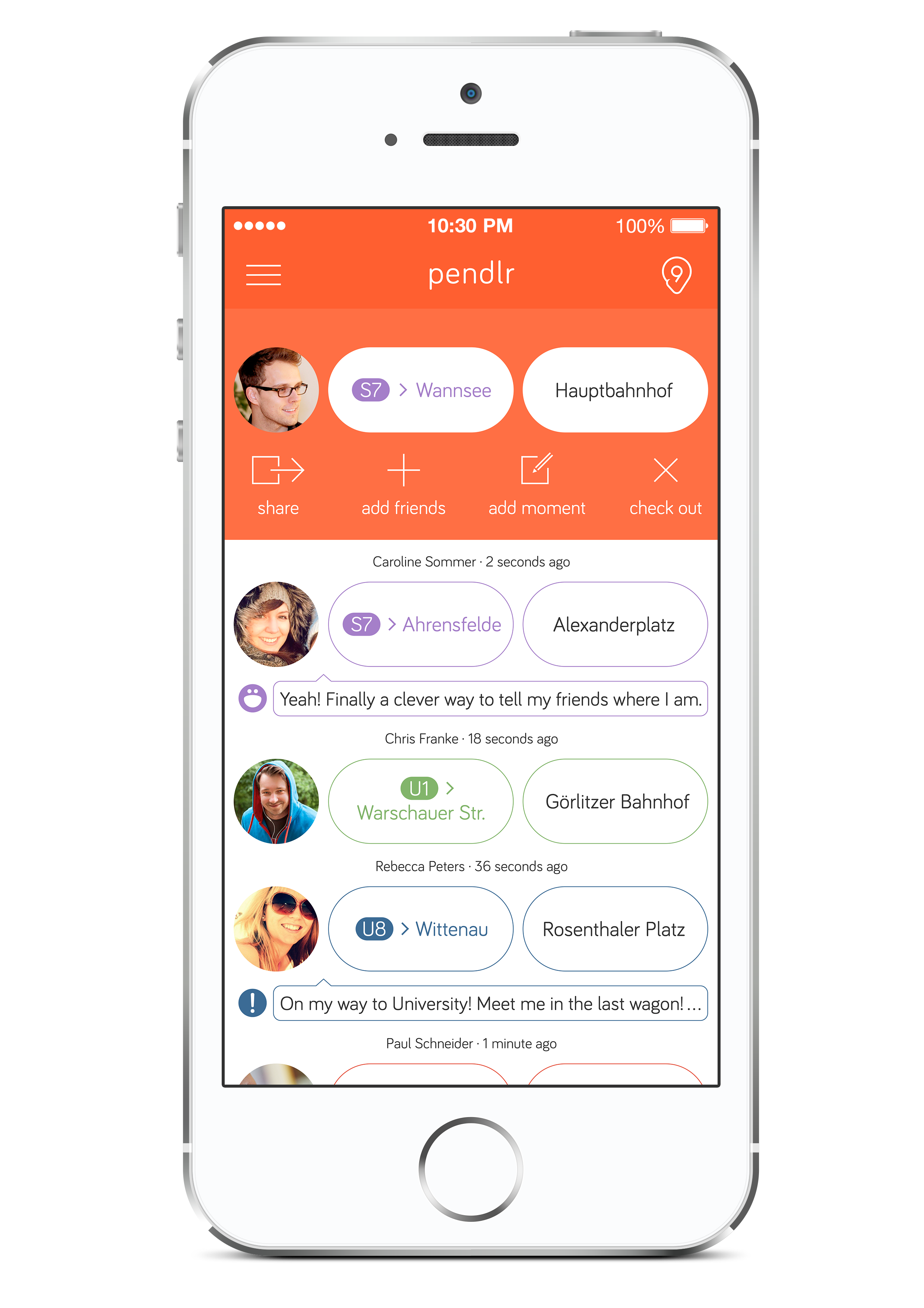
In the end the core of Pendlr featured a list of friends currently using public transportation with information about the line they use and the last station they checked in to automatically.

Pendlr is an iPhone application that makes using public transportation a social experience. The app allows everyone to share their current trip on the public transportation network. Friends are able to see if a friend is on the same train or whether a train is crowded or has any kind of delay or interference.
As students of the University of applied sciences in Potsdam – but living in Berlin – most of us had to commute to university daily around the same time. Unfortunately we often didn’t manage to take the same train since it was just hard to manage. We wondered what a service would look like that would tackle this and other problems related to public transportation.
We took a look at how people share their position with friends.
At the time Foursquare itself was still handling check-ins on its own instead of splitting this functionality into a separate application. In comparison we wondered what an application for check-ins into non static locations would look like and how this would affect the UI.
On a technical side we spent lots of time getting data about public transportation and setting up our own database about the public transportation in Berlin. That included timesheets, routes and all the stations in and around Berlin. Since there was no API available we scraped data on our own and processed them in a way we could use them.
The difference between a static and a non static location are the added dynamics that need to be visualized in the interface.
Since we were dealing with public transportation we wondered if a map-like interface as the first level of interface could be a working approach but soon realized a lack of clustering and highlighting would be a problem (for example to visualize past journeys). Instead a map could be a good option for the active checkins only as an optional view, or as we later found out, as part of the check-in itself.
Another approach we explored early on was the behavior of a notification-like stream of changing status (not necessarily including push notifications). This for example included current positioning of vehicles related to station and lines. Quickly testing this approach we realized there is a clear need to minimize the visual actions on screen even though we were dealing with constantly changing information.
This constant change of information led to our final interface approach. Taking a step back to a list-view that should order itself by time with the most recent change on top, we explored how we could minimize the visual distraction. Due to our visual design we ended up with an approach called “pills”. By using the same structure of a list but dividing the single cells into single elements we were able to either reposition cells completely (bringing them up if they contain the most recent update, or down when they are closed) or just change certain elements of the information as subtle as possible.
In the end the core of Pendlr featured a list of friends currently using public transportation with information about the line they use and the last station they checked in to automatically.

Creating a check-in is one of the core actions of Pendlr. Static location based check-ins are usually less complex information clusters with the location information as the main variable. With non static locations we have to check different types of variables to properly check-in. This in our case includes the current location/station, the line, the direction and the departure/arrival time at a certain point.
Knowing we need to get this information by the user we faced a need to make the process of information gathering as quick and easy as possible. Future plans of Pendlr would have included a routing option. By presenting a route we could easily let the user just select it and check him in into the selected one. Since the routing was something for a future release we needed to create a convenient way for manual check-ins.

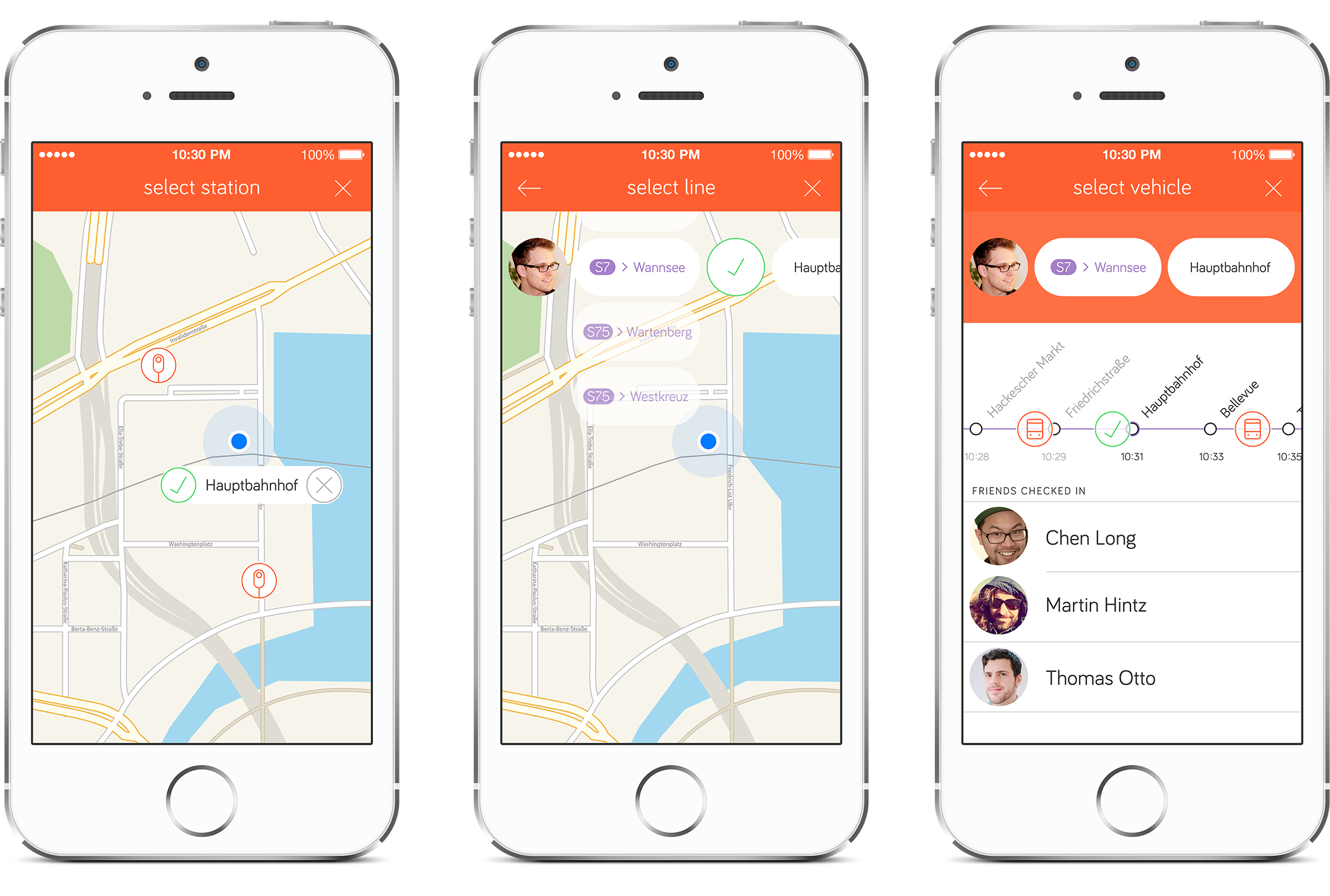
Creating a check-in opens a map to select the station with the nearest station around preselected. Selecting a station creates an entry with the previously mentioned station pill at the end of a check-in entry as the most often changing element. Selecting a line from a list in alphabetical order is done by swiping the matching one in place or tapping on it. The user is presented with a detail screen of the line he selected showing him the arriving and already departed vehicles based on the station he selected. Selecting a vehicle shows the friends already on it. A new checkin is created.

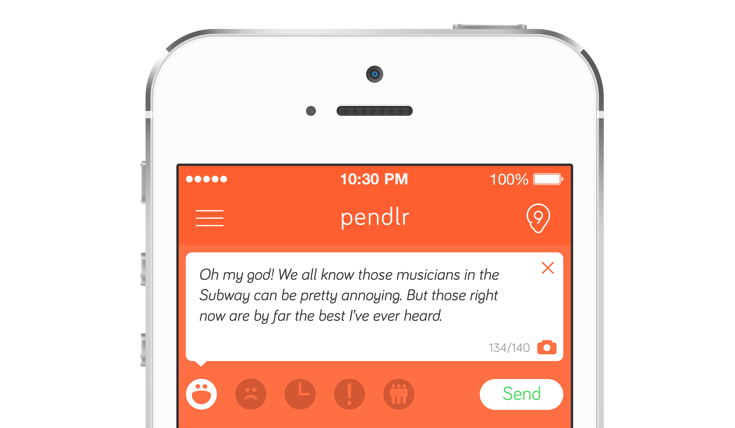
To enrich the experience and gather crowd based data for vehicles we introduced “Moments”. These let you add contextual information of your ride based on five different categories you could share with your friends. These Moments are then visualized along the check-ins in the stream.

After some research we figured out the most relevant moments in public transportation can be split into these categories:
Joy for sharing nice impressions. Anger for sharing bad impressions. Time for informing people about a delay. Attention to tell people about ticket controls or other urgent things. Capacity for telling people how crowded the vehicle is or where they are located.
Checking in into public transportation comes along with a problem: Network connection. Our concept requires precise location tracking to exactly map the position of a vehicle – using the user’s GPS location – and share information like delay, capacity and personal position with others in realtime. A problem that turned out not to be as problematic as imagined but still affected the user experience negatively.
Besides technical and design related learnings we learned a lot for future projects in terms of organization. Being our first big project of software design and development we learned how important it is to sometimes “kill your darling”.
Defining key functionalities and build everything around the minimal viable product vertically instead of working on different features horizontally today clearly seems like the better option.
The visual change from iOS6 to iOS7 turned out the be a challenge as well. From today's point of view the iOS7 redesign would have required a fresh start for the UI, not only the visual layer but to a certain degree affecting the interaction paradigms as well. A step we probably were too afraid to do or not fully went. In the end – after more than one year of work as a side project next to university in our free time and losing one of three founders we realized we on the one hand underestimated the amount of work that needed to be done on such a complex product and on the other hand had some timing issues. The visual change of iOS and the fact that check-in platforms appeared more and more outdated were additional bottlenecks leading us to putting Pendlr on hold.
Even though we had a product that just needed a little more work and quite promising user tests we had to realize we worked to much on a software for a very specific target group. Looking back Pendlr clearly taught us a lot about what is important when creating a product for the future: Manage your time, clearly define goals and responsibilities and kill your darlings if necessary. Even though Pendlr is on hold for now we really enjoyed working on it and we are still considering reviving it with a different focus in the future.
| Date | 2013 – 2014 |
|---|---|
| Platform | iOS (iPhone) |
| Status | on hold |